Modernizing USAA Servicing Intent Screens
Project Overview
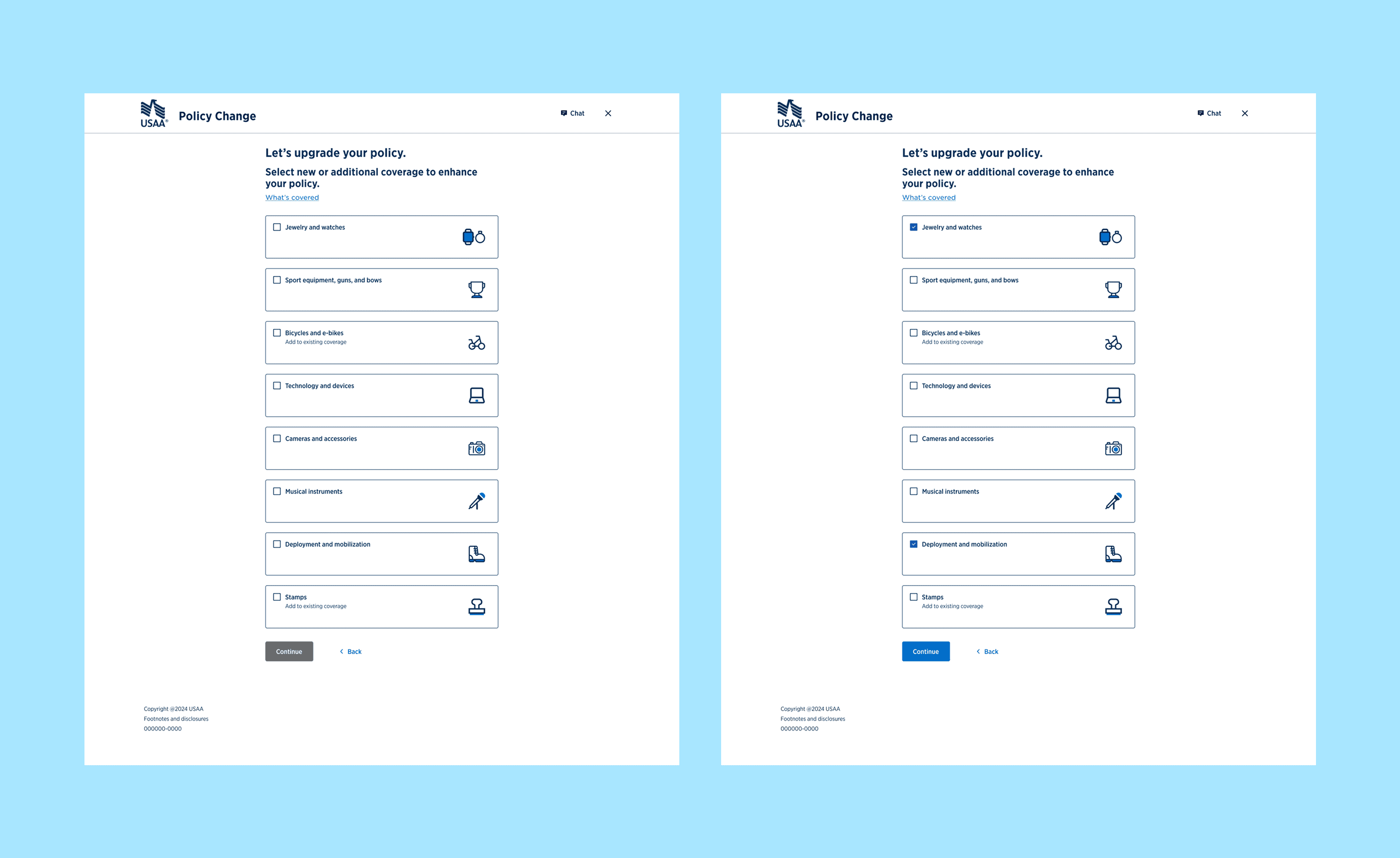
During my time working at USAA, I led a significant initiative to enhance the user experience across their digital platforms, specifically focusing on the servicing intent screens for both mobile and web. These critical screens enable USAA members to view their current coverages and explore options to upgrade or add new ones. My core objective was to simplify the process of adding new or additional coverage to an existing policy, while simultaneously modernizing these screens to improve usability, align with contemporary design standards, and ensure strict compliance with the comprehensive USAA design system. This complex project necessitated close collaboration across multiple disciplines, including UX writing and accessibility.
The Challenge
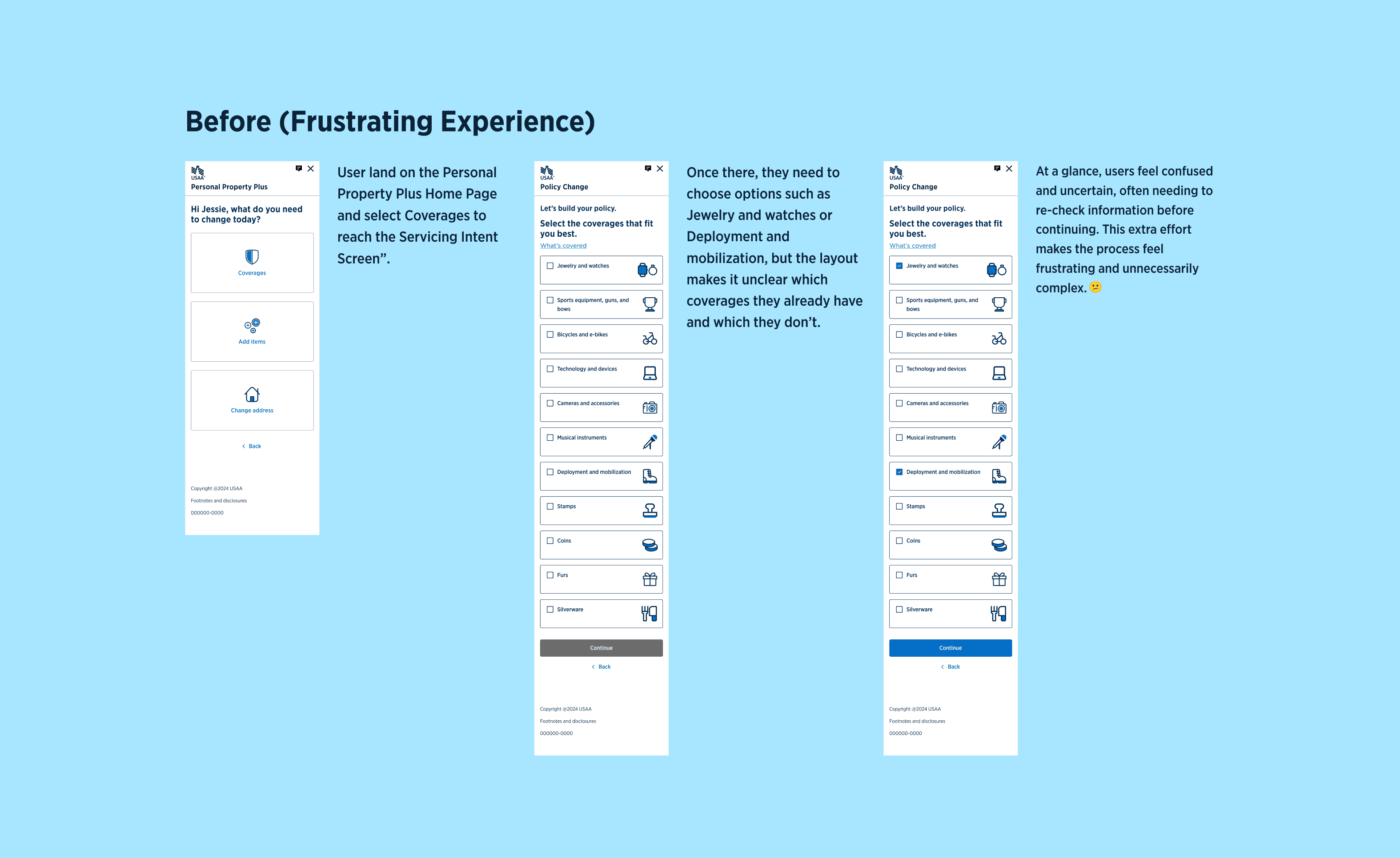
Prior to this redesign, USAA members seeking to expand their coverage faced a cumbersome and often confusing experience on both mobile and web. The existing process was characterized by numerous screens, an overwhelming density of options, and an excessive number of user steps. This complexity not only led to significant user frustration but also increased the propensity for human error. Recognizing this critical issue, our team at USAA identified a pressing need for a more intuitive and streamlined approach to enhance the user experience and, consequently, boost the successful acquisition of additional policies.
My Approach: A Structured UX Process
Competitive Analysis & Inspiration
I began by conducting a thorough competitive analysis to understand best practices and innovative approaches employed by other leading companies for similar tasks. Complementing this, I curated a mood board featuring contemporary design patterns and intuitive layouts from a diverse range of successful apps and websites. This provided valuable inspiration and helped define a modern aesthetic direction that resonated with USAA's brand while pushing design boundaries.
Wireframing & Design Exploration
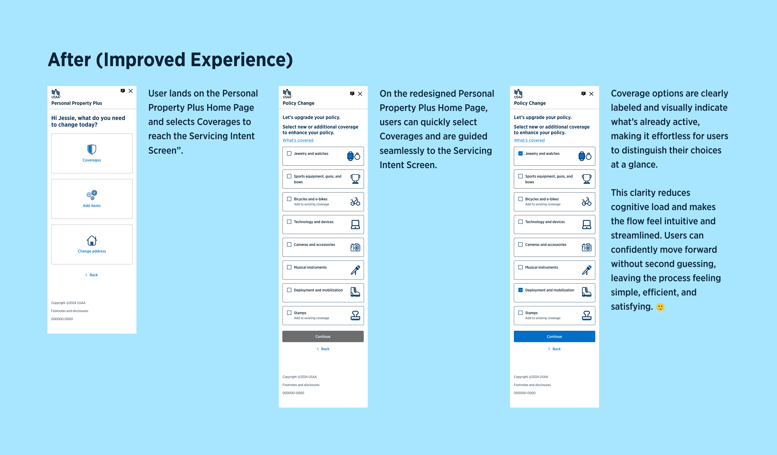
Leveraging the insights gained, I developed several distinct wireframe options for both mobile and web, meticulously prioritizing ideas that strictly adhered to the constraints and guidelines of the USAA Reville design system. I systematically evaluated these options based on feasibility, user impact, and overall effectiveness, iteratively refining the most promising choices into more polished, mid-fidelity designs.Stakeholder Collaboration & Voting
Transparency and alignment were crucial. I presented the refined design options to a diverse group of stakeholders, including key team members and business partners. This collaborative forum allowed for open discussion, feedback integration, and culminated in a collective voting process to select the most viable and impactful design directions. This ensured strong organizational buy-in from the outset.Accessibility Review
Before transitioning to high-fidelity mockups, I initiated a proactive consultation with the accessibility team. This critical step ensured that our proposed designs inherently met user-friendly standards and were inclusive for all audiences, embedding accessibility from the foundational design phase rather than as an afterthought.High-Fidelity Design & Implementation
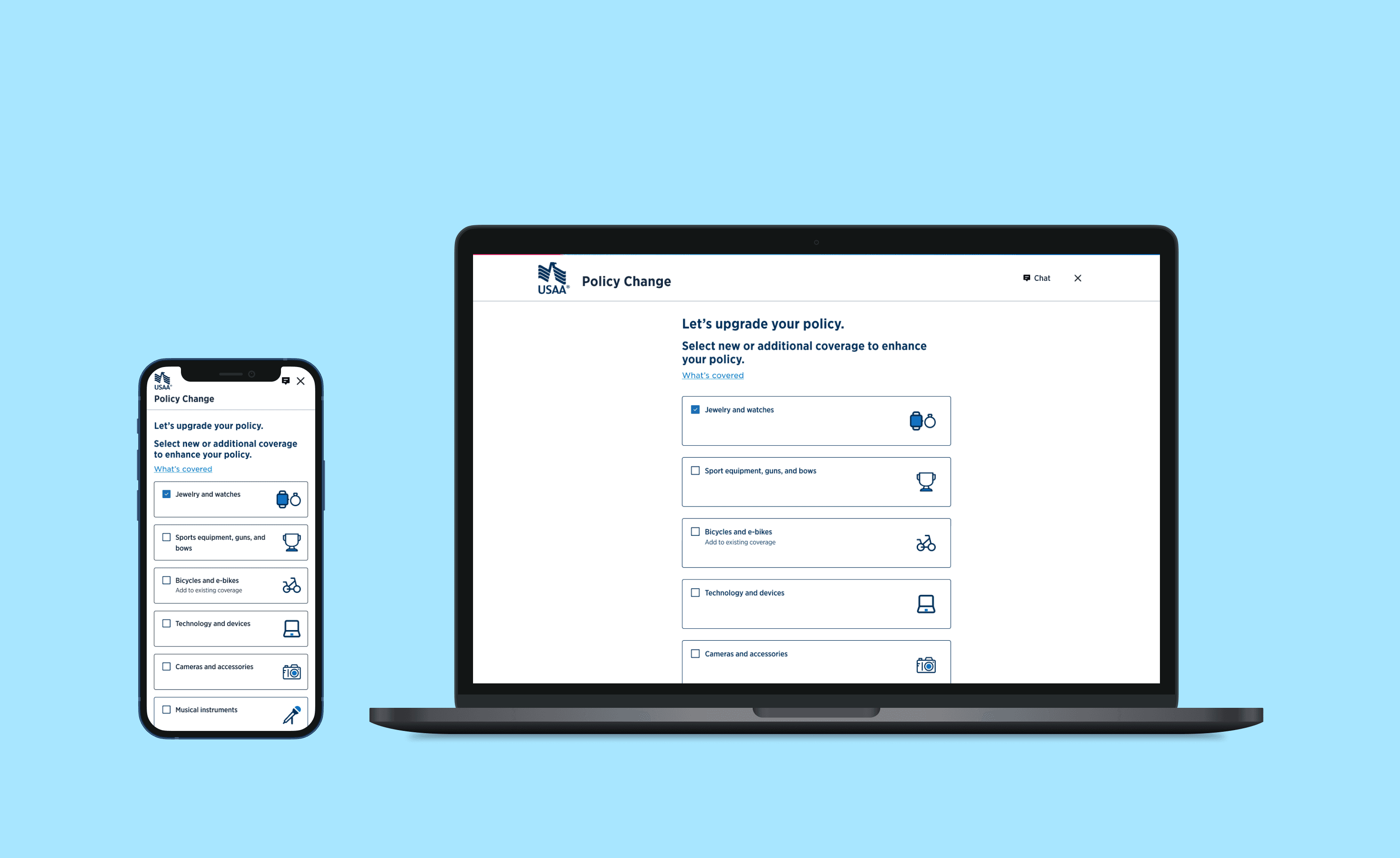
Upon incorporating all feedback and securing final approvals, I meticulously crafted the high-fidelity mockups for both mobile and web. These pixel-perfect designs were then prepared for the initial Minimum Viable Product (MVP) phase of implementation, setting the stage for real-world user interaction.
Adapting to New Business Needs
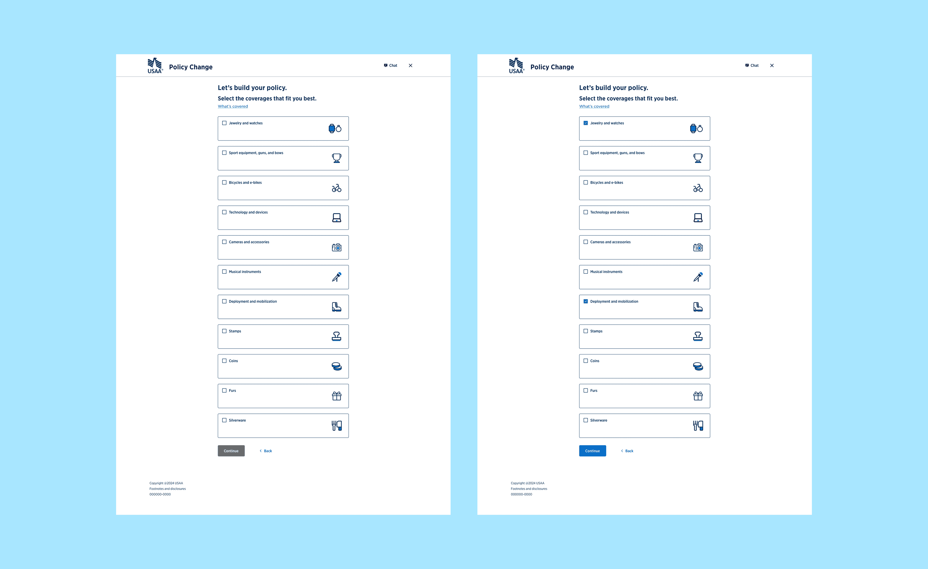
During the MVP development phase, a significant business requirement emerged: an update to the category taxonomy, which substantially expanded the number of coverage categories available to users. This presented a new, unexpected challenge: how to clearly differentiate categories users were upgrading from existing policies versus those they were adding as entirely new coverage.
Content Collaboration & Solution
The UX writer initially proposed several ideas to clarify these categories, but the proposed text felt too generic and didn't effectively address the critical distinction. Recognizing this, I proposed more precise and nuanced content solutions that directly communicated the difference between upgrading and adding new coverage. My approach resonated strongly with the team, and we ultimately moved forward with these more tailored content recommendations, proving the value of a designer's input in shaping crucial user-facing text.
The Impact
The completed redesign of the servicing intent screens delivered a profoundly improved and intuitive experience for USAA members across both their mobile application and web portal. Post-launch analytics and direct user feedback conclusively demonstrated the success of our efforts:
Enhanced User Satisfaction & Clarity: Members consistently reported a clearer, more intuitive experience, leading to a significant uplift in overall satisfaction. The modernized design improved alignment with USAA's brand while directly supporting enhanced usability.
Improved Decision-Making: The updated content strategy, particularly around differentiating upgrades from new additions, significantly enhanced users' ability to make informed decisions about their coverage needs.
Increased Efficiency & Reduced Errors: By streamlining the user flow and providing unambiguous guidance, we observed a measurable reduction in user errors and a more efficient process for adding or modifying policies.
Strengthened Brand Perception: The cohesive, user-friendly, and accessible design reinforced USAA's commitment to member-centric digital experiences, further enhancing their brand perception.
This project exemplifies the critical importance of a structured design process, seamless cross-functional collaboration, and the adaptability required to navigate evolving business needs. It underscores how user-centered thinking is paramount in creating truly effective and impactful digital experiences.