Accessibility Markup for Foundation Review
To enhance the accessibility and user experience of USAA's Personal Property Plus insurance service, we aim to ensure it is user-friendly and compliant with WCAG 2.1 AA standards for all users, including those with disabilities, while reducing the number of defects identified in last year's review.

Challenges
Complex User Journeys: Simplifying the intricate insurance processes for users with varying abilities.
Regulatory Compliance: Ensuring all design elements meet stringent WCAG 2.1 AA accessibility standards.
Diverse User Needs: Catering to a wide range of disabilities including visual, auditory, and motor impairments.
Time constraints: We had a tight deadline for our designs to pass the Foundation Review and ensure they met Accessibility and Reville Design system standards.

Approach
Reville Design System Audit: I reviewed every wireframe for both mobile and desktop, ensuring each component was used correctly. Our sister team had several deprecated buttons that needed updating, so I made sure to address every defect they encountered in our designs.
Accessibility Compliance: Despite the Reville design system being WCAG compliant, I created detailed accessibility markups for all our wireframes, which I expand on in the next section.
RDS/Ally Review: Experts from the Reville design system and Accessibility team reviewed our Figma file, identifying defects and suggesting improvements.
Refining Designs: Based on the feedback, I iterated and refined our designs, continuously ensuring that any updates to wireframes were accurately reflected in our accessibility markup.

Game-Changing Annotation Steps
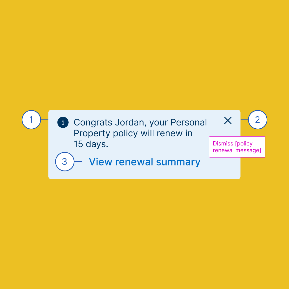
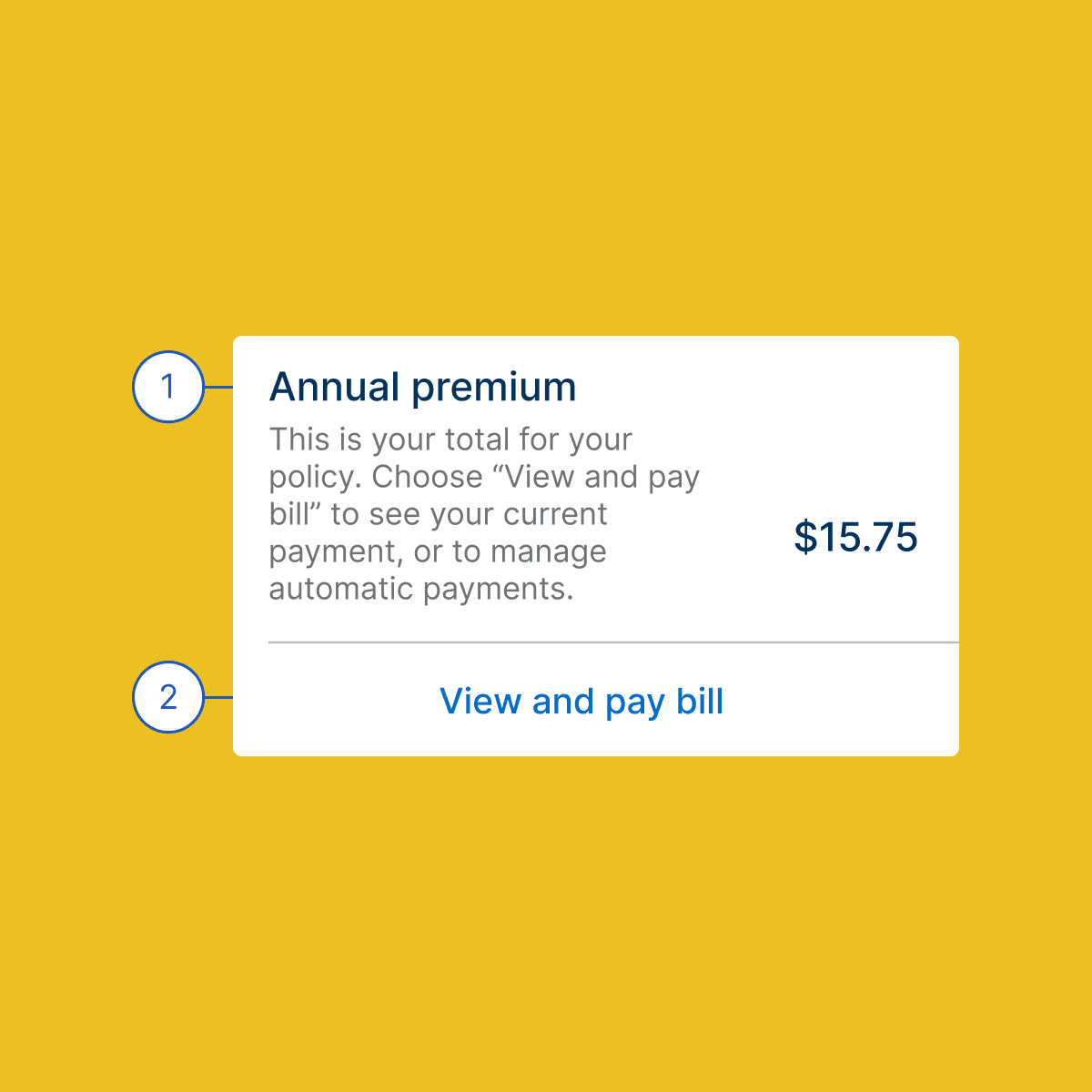
Tab/Reading Order: Mastering Flow: We ensured that users could seamlessly navigate through the interface, marking up content in a natural reading order from left to right. Having a premade number component allows you to easily update numbers in your designs, maintaining numerical order.
Header Text Enhancing Experience: For native apps, we used "H" to indicate headers without numbering, simplifying navigation for screen readers. For web experiences, we used H1-H6, ensuring only one H1 per page.
Element Outline Defining Clarity: We used element outlines for interactive elements like links, buttons, radio selections, and checkboxes to guide reading sequences from left to right and top to bottom. These thin rectangular borders help indicate how elements should be read or tabbed through.
Hidden Text Filling Gaps: We used hidden text to make vague CTAs more descriptive, updating CTA text whenever possible to create a well-rounded experience. By enhancing titles and CTAs, we ensured users could clearly understand their tasks, filling in gaps with hidden text when necessary.
Images Visual Aid: We ensured alt texts were concise, aiding screen reader users and those with cognitive disabilities. Adding concise alt text for images and graphics makes content more accessible and easier to understand for all users.
Links Connecting Everyone: Navigate the web of accessibility with links that ensure all users can easily find and access content. By creating clear and descriptive links, we help users seamlessly connect to the information they need.

Results
Increased Team Collaboration: The team collaborated effectively after the Design System and Accessibility review, addressing comments and suggested resolutions. This led to multiple improvements, enhancing the usability of our designs.
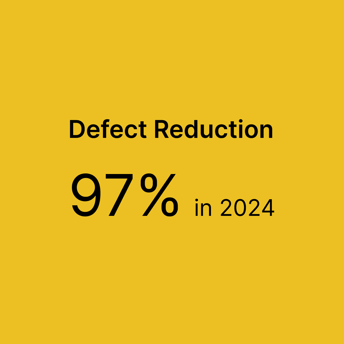
Reduction in defects: By reviewing and addressing last year's defects, we were able to reduce defects by 97% in 2024, significantly improving design system and accessibility compliance.
Conclusion
The redesign of USAA's Personal Property Plus service was a journey of empathy, innovation, and meticulous attention to detail. By prioritizing the needs of users, we significantly improved the accessibility and overall user experience. This project underscores the profound impact inclusive design can have, fostering satisfaction and compliance while championing the needs of all users.